As a long-time specialist in steering units for commercial vehicles Hydraulik Nord Fluidtechnik (HNF) offers individual product solutions in a wide range. Until 2013 HNF was producing as a contract manufacturer for big companies in the industry of agricultural and construction vehicles. In 2014 the company started developing new hydraulic products including taking care of sales on her own. The company did exsist – but the brand did not. In cooperation with Maria Weding, Schwerin, Kollaborat developed the brand with all its facets.
Launching the new Hydraulik Nord Fluidtechnik brand
Background situation
Hydraulik Nord Fluidtechnik developed and produced steering units for agricultural and construnction vehicles as a white label for Bosch Rexroth. In 2013 HNF also integrated the sales sector – and was responsible for saling and distributing their products by themselves. But the company lacked a competitve brand to be able to operate world wide. They were facing a new challenge of competition and sales.
„We have to do something now.“André Knaack, Head of Sales

Brand clarification workshop
A brand clarification workshop with participants of all mangagement levels and departments helped integrating the company in the corporate identity process. How does the brand feel like? What are the relevant characteristics of the brand? What is the differentiating factor to competive brands? With several creative and strategic trainings the company’s identity and its intended image have been shaped out.


Brand strategy
The conclusions of the brand clarification workshop have been worked out to brand values and tonalities. An overall brand idea out of the brand strategy delivers the theoretical base for the visual design process. Designed graphical moodboards show the first realisation of the strategy.


The triangle shows the moment of enabling.
Basic elements
Logo and claim
Well-known visual parts og the logo were kept and typographically harmonized. Adding an english written claim opens the brand for global markets.
Colors
The color scheme has been sharpend: the bright turqoise strengthens the recognition and marks the visual difference to competitors. The dominating white color represents the clarity and openess of the brand.
Design principle
The flexible design principle embodies the brand idea: the triangle as a key visual stands for HNF and shows the moment of enabling. This originates the stage für partners, clients and employees. The accent strip emphsizes the cooperation between both parties.
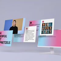
Imagery
Lighting moods and an authentic depth of field define the imagery. It makes this engineering brand approachable and emotionalizes it. Next to products, also working processes and product implementations are shown.
Typography
Typographically HNF embodies with a combination of the type face Brix Sans and Brix Slab continuity and clarity.

Communication media
Supporting the sales team with new tools to face the growing challenges of competition in the engineering industry traditional communication media has been designed.


Online brand manual and brand training
The HNF brand portal documents as an online styleguide all aspects of the new brand. Information about brand strategy and detailed communication media are accessable for users world wide. Digital templates such as logo files and MS Office templates are provided throughout this tool. The brand portals works as a safe, always up to date brand information and marketing platform for internal and external partners.


Project facts
Time: April 2014 – January 2019
Client: Hydraulik Nord Fluidtechnik GmbH & Co.KG, Parchim and Hydraulik Nord Group, Ludwigslust
Job: Development and implementation of brand strategy and corporate design, fair booth design
Participation: Jakob Gleisberg, Hendrik Möller, Jessica Chau, Melissa Ristau
In cooperation with Maria Weding