
Kollaborat developed the corporate design for the engineering firm Sebastian Rucks in Leipzig. In a joint brand development process, we established the cornerstones of the brand identity and refined what sets it apart from others: as an external project manager, Sebastian Rucks takes on leadership responsibilities at short notice in electrical contracting firms – thereby restoring planning certainty, control and decision-making authority. He combines in-depth electrical engineering expertise with extensive commercial experience. A combination that is rare in the market. The +Rucks brand highlights this advantage.
+Rucks Corporate Design for the engineering firm Rucks
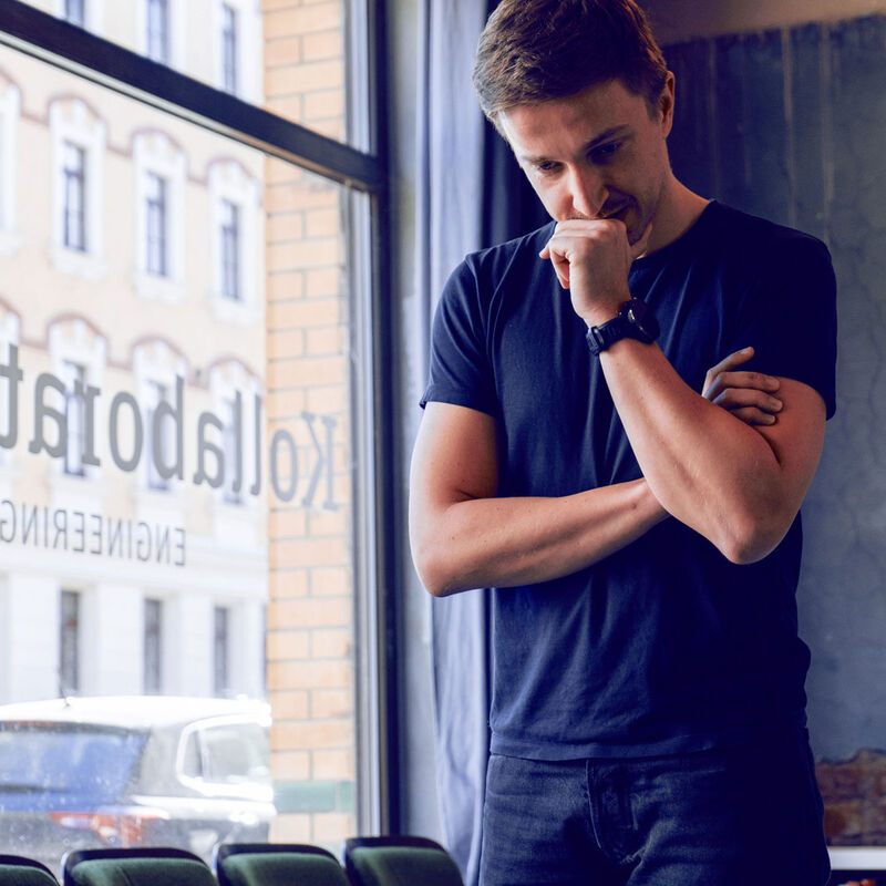
Brand and Person
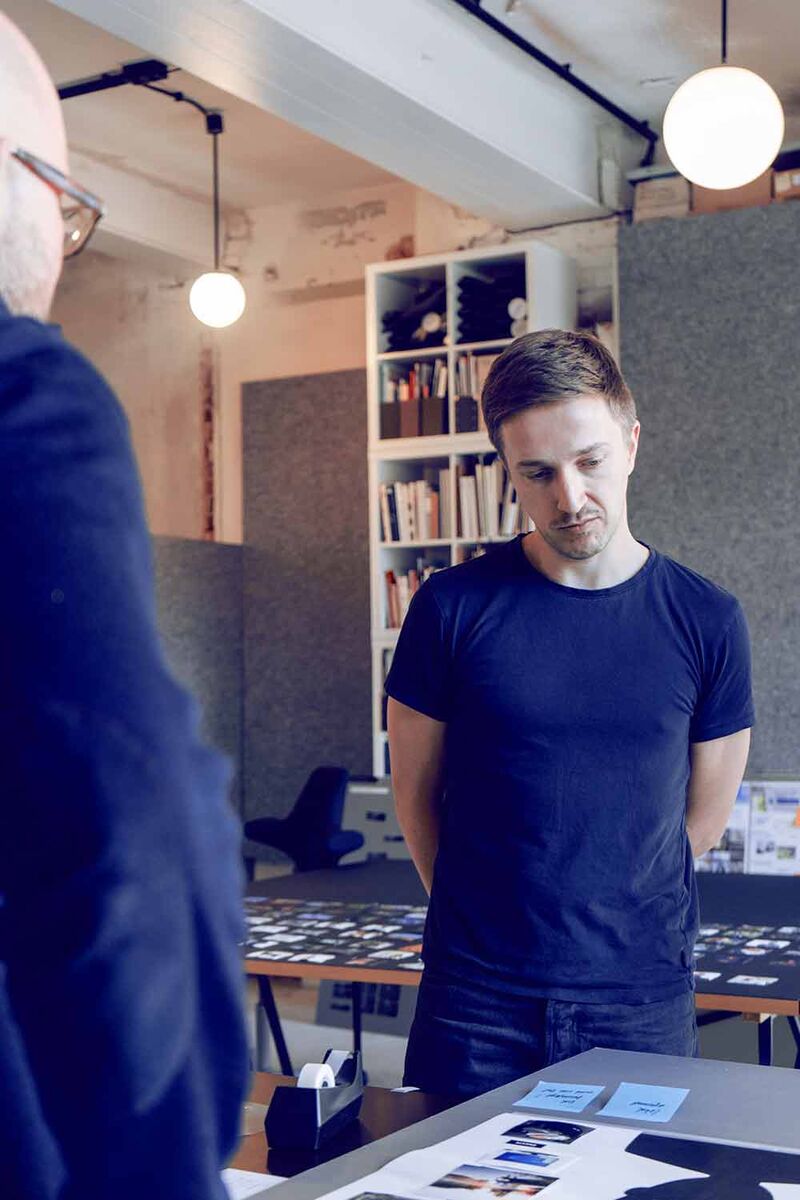
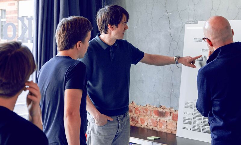
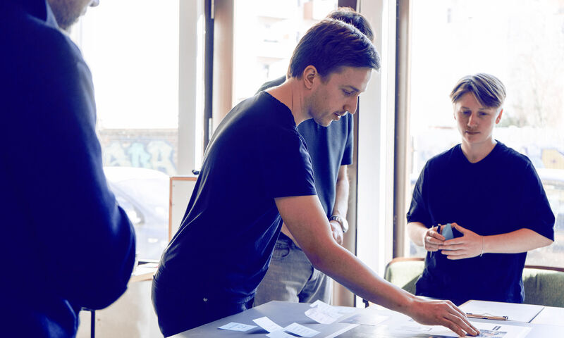
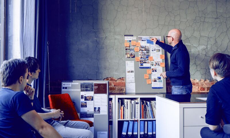
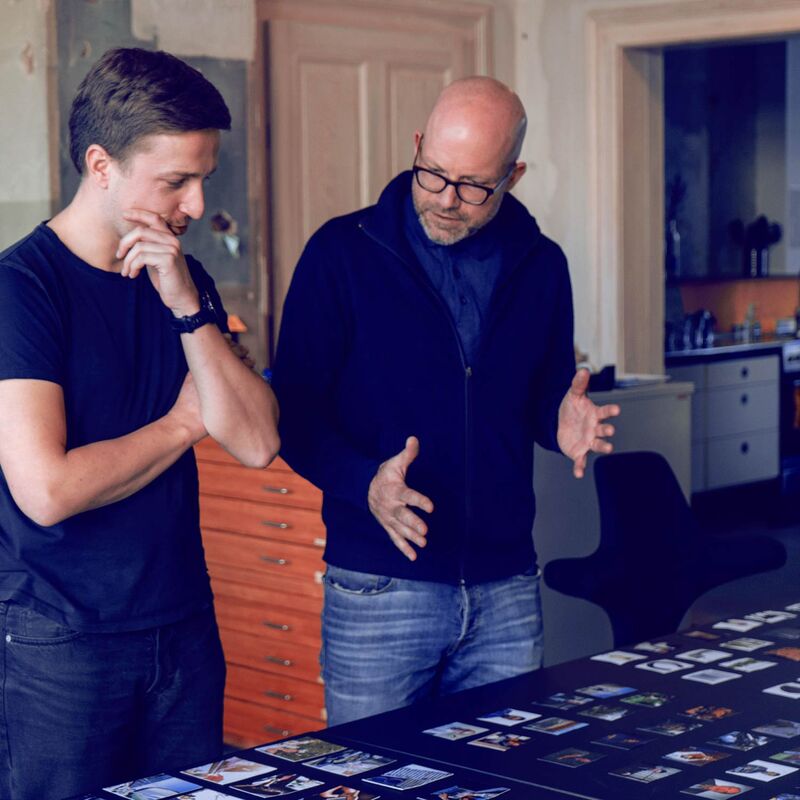
In the workshop, we dug deep: Who is Sebastian Rucks, how does he work, and what does his counterpart really need? A clear picture emerged – that of a specialist who exudes calm and bridges the gap between planning and implementation. As a rational specialist brand, he deliberately positions himself in contrast to generalist competitors. Together, we developed the values that underpin his work: transparency, foresight, reliability and cooperation.
“You only get to know a good helmsman in a storm.”


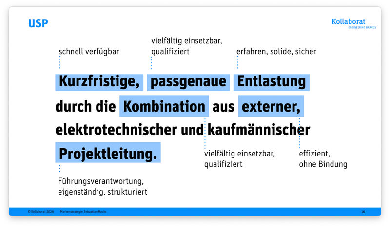
Short-term, tailor-made support through a combination of external, electrical engineering and commercial project management.
Market positioning
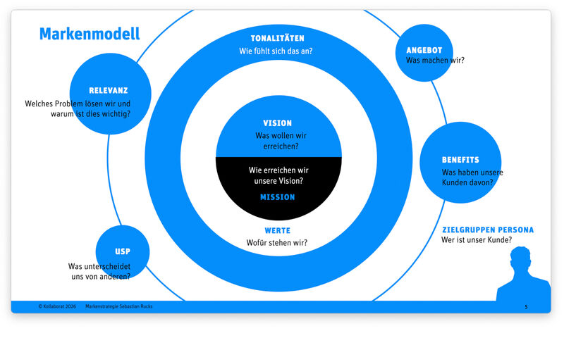
The brand strategy is based on a specific problem: electrical contractors come under pressure during peak periods – additional work is not claimed in a legally compliant manner, and processes become disorganised. External project managers who can provide effective relief at short notice are rare and little known. This is precisely where Sebastian Rucks comes in. His mission: to restore planning security, control and decision-making capacity to the company by temporarily taking on management responsibilities. The vision is deeply human: as work-life balance improves, so does the scope for development.
Naming and logo development
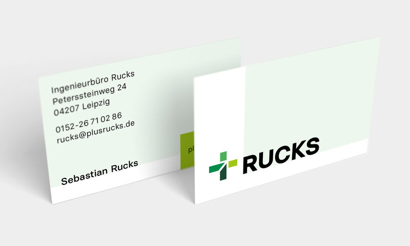
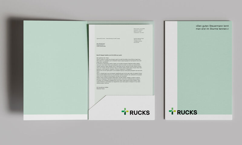
The brand name +Rucks is the idea in its purest form. The plus sign originates from the electrical engineering sector – it stands for a positive attribute, for ‘adding to’ and ‘complementing’. It is the added benefit the client gains. The idea is so strong that it needs no further embellishment. The figurative mark is derived directly from the plus sign: two interlocking elements, precise and structured. The word mark RUCKS is set in the Basier Square typeface – a geometrically constructed sans-serif font that radiates clarity and sobriety and suits a man who values clear words.
Colour scheme and typography
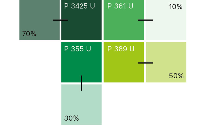
The brand’s shades of green symbolise growth, reliability and freshness – and are deliberately distinct from the blue and red tones used by many competitors. A rich dark green and a vibrant light green make up the colour spectrum: grounded yet energetic. Light areas in halftones give the system breathing space. The typeface in black or white ensures maximum legibility and a matter-of-fact sobriety.
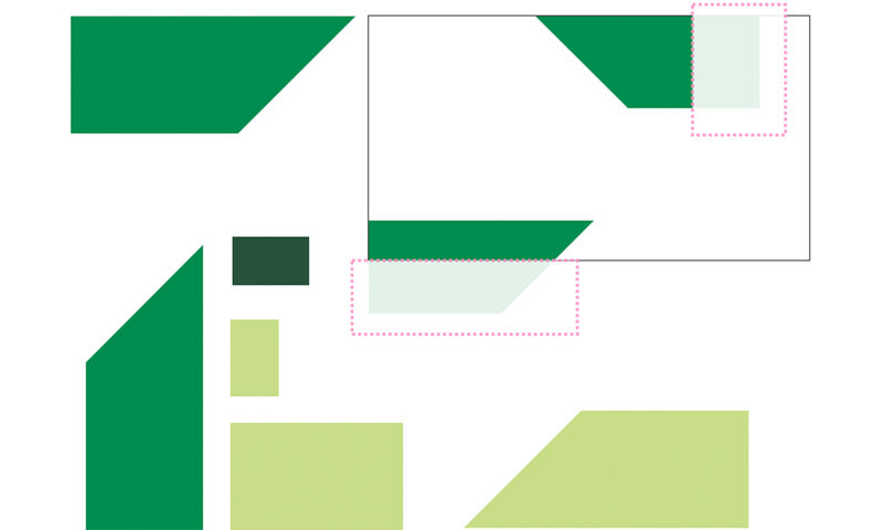
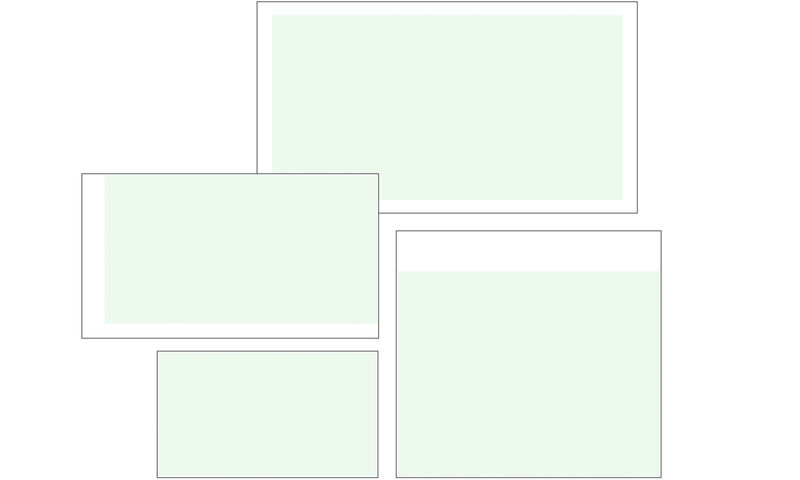
Design system
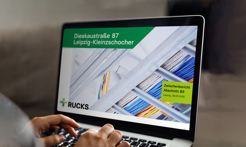
The design system follows a clear principle: elements in solid colours represent the key players – derived directly from the logo. Areas in halftones form the stage: space for collaboration, for projects and their outcomes.
The elements are positioned at the edge of the format, arranged orthogonally, with a free choice of colour from the colour palette. The logo is left-aligned – ideally at the bottom, from where the impetus for the project symbolically spreads out. A flexible yet consistent system that demonstrates structure without appearing rigid.


Project details
Client: Ingenieurbüro Rucks, Leipzig
Duration: February 2026 – May 2026
Sector: Services, project management
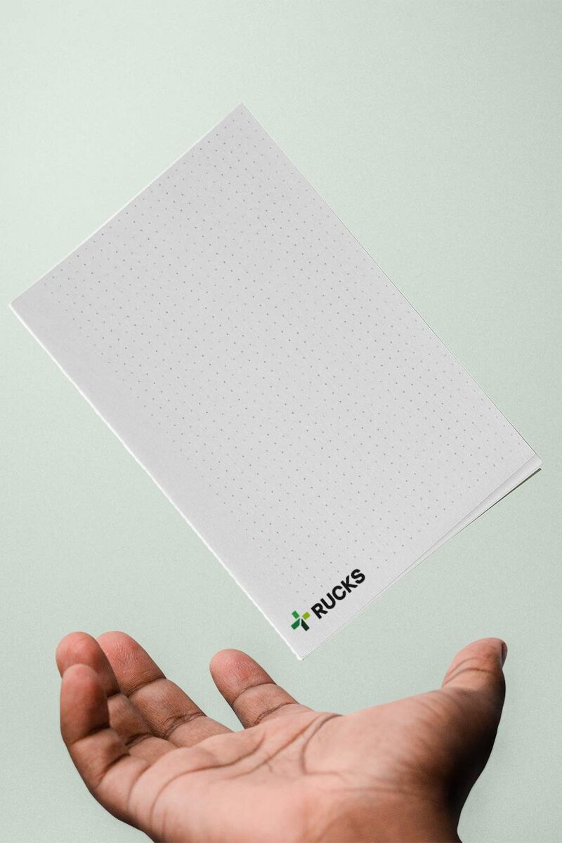
Services: Brand strategy, corporate identity, corporate design, business stationery
Team: Joey Förster, Jakob Gleisberg, Hendrik Möller

