The Muenchen.Digital.Erleben brand gives digitalization in the state capital of Munich a clear face. Together with the team from Muenchen.Digital.Erleben. Kollaborat has developed the brand further and strengthened it for digital use.
Digitalization in the state capital of Munich


Munich.Digital.Experience.
In a pitch on brand development in December 2020, Kollaborat prevailed. Together with the team from München.Digital.Erleben. collaborated to further develop the brand. To this end, the corporate design was analyzed at the beginning, design elements were functionally further developed and given meaning. The color spectrum was reduced and a flexible layout principle was developed.
Munich.Digital.Experience. is now visually concentrated, tidy and freed from an abundance of color accents, overlays, transparencies and decorations.
The brand communicates in an understandable and clear manner, it is prepared for its digital environment and is enthusiastically received internally.
People are at the center of digitization. Therefore communicate
Let's discuss and shape digitization together.
With the brand Muenchen.Digital.Erleben. Digitization becomes visible in Munich and takes shape.
Mission of the brand
The Muenchen.Digital.Erleben. brand is the home for all Munich residents. It is a campaign brand of the state capital Munich and lives in a symbiosis with all the presentations. Digitization in Munich is not static, but lively, people-oriented and emotional.
The aim of the campaign is to make digitization tangible for everyone. Exchange and synergy are essential for Muenchen.Digital.Erleben. elementary. It is the campaign where people dock and knowledge and contacts are conveyed. Muenchen.Digital.Erleben. is easy to understand for everyone. The campaign highlights the benefits of digitization, reduces complexity and works with icons, among other things.

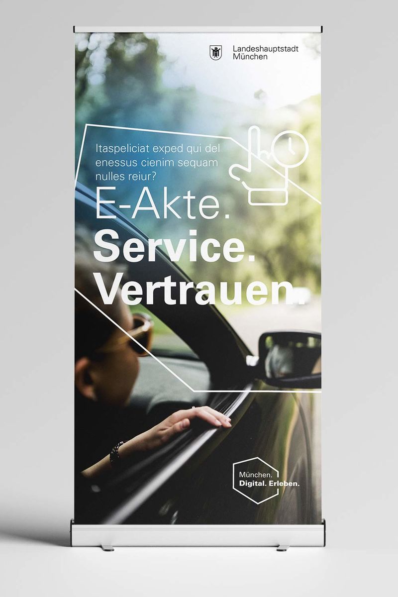
Logo – open flexibility
The word-image logo presents the topic of digitization dynamically, spatially, abstractly in a complex structure. In the black and white version, the logo is neutral and harmonizes with the logo of the state capital of Munich. If the campaign brand is used without the logo of the City of Munich or its presentations, the placement and size of the word / image brand can be freely selected.


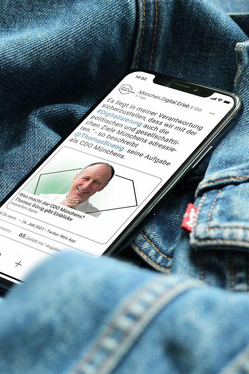
The digital shimmer - in the glow.
The glow affects all digital projects in the state capital of Munich. It is diffuse, vague, open like the feeling of something new and intangible. It functions as a stage behind the text level or as a shimmer above the picture level.
Digital and sustainable - in color.
Digitization in Munich is fresh, agile and open. That is why white is an important part of the brand.
Petrol and blue are the constant companions of the brand. They stand for technology, functionality and vision. They generate trust and sympathy.
The warm green tone complements the color canon with the human and sustainable aspect of digitization.


Relationship and focus - with the Flexigon.
Digitization means flexibility and constant further development. The shape of the Flexigons reflects these characteristics and is maximally adaptable. The Flexigon is derived from the word-image brand and shows how flexible and concrete digitization is in Munich.
With the Flexigon, the relationships to the actors become visible, as it is placed on image motifs around them or connects headlines with image motifs.


We for you. - in the imagery.
The imagery shows the deeper mission of the campaign brand: for and with people.
In the visual language, technology and a committed city administration are related to those who live in Munich, learn,
work.
Abstraction, information and clarity. - with icons.
Icons support the campaign brand in its mediating task. Complex topics of digitization are presented in easy, visual language. The more than 70 icons have been adjusted in size and design.
The Univers - in typography.
The contrast in the font sizes and styles creates a recognizable typography. This gives the headlines a positive dynamic.
In the word / figurative mark and also within the headlines, the point marks a change in the font styles. The point is a defining orthographic-visual design element of the campaign brand.


Manage order - in the layout.
Visual tension arises between emotional photos and abstract icons, between light and dark, color and neutral white, linear and flat.


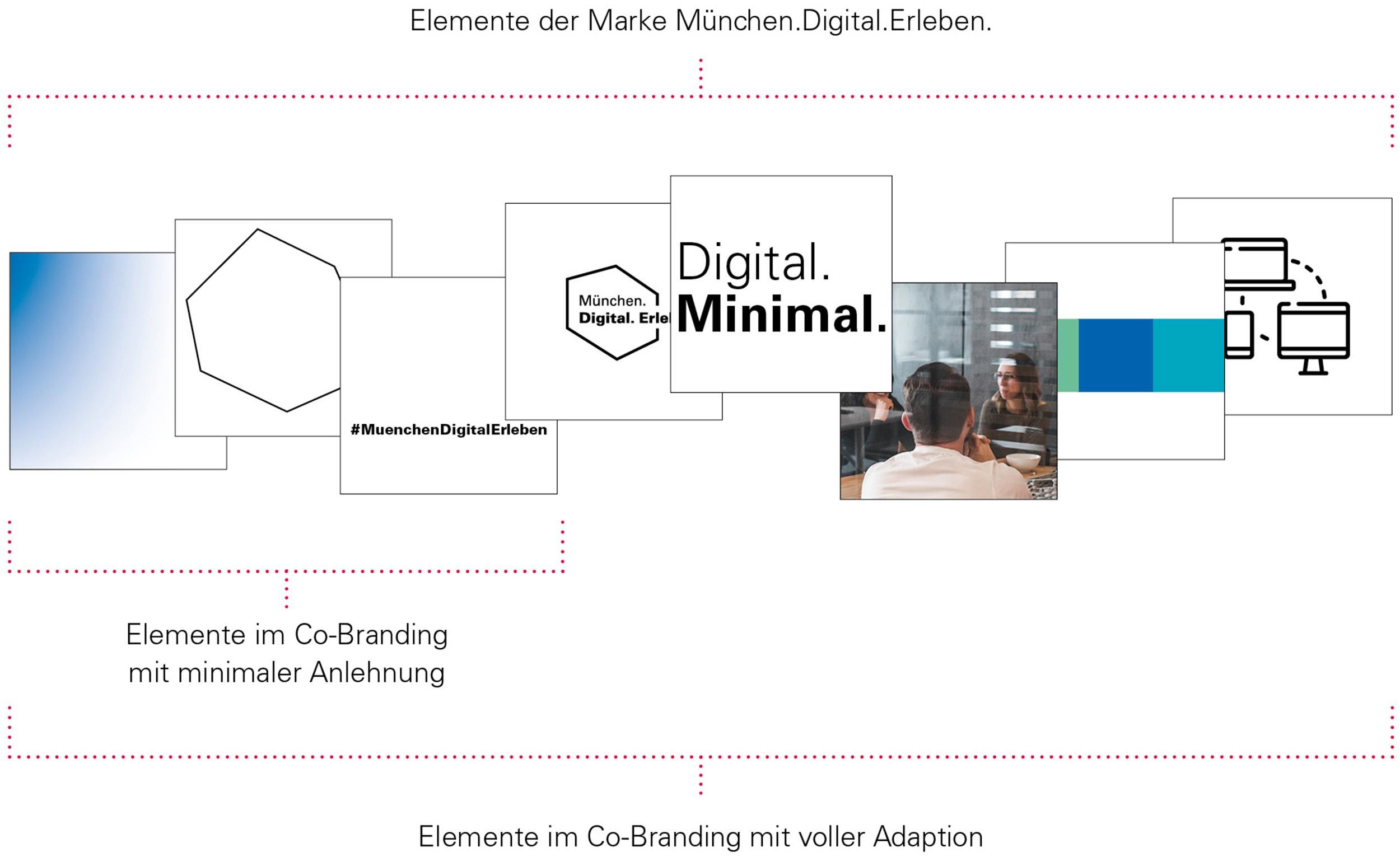
Connect potential across departments - in co-branding.
With the option of co-branding, projects from different presentations can appear in a uniform look. The visually connected appearance becomes digitization
Munich is visible and thus strengthens Munich’s digital location. Co-branding also enables the presentations to be visually independent. The elements Glow, Flexigon and the hashtag of the
Campaign brands are the minimum equipment in co-branding.
Munich is successfully on the way to digitization. The brand identity now adequately shows this.
Every department in the City of Munich can use this brand world for their digitization topics - 100 percent or in the form of co-branding. In this way, all efforts to digitize the state capital of Munich are visually uniformly transported across the city, while the individual identities of the presentations are retained.
Project facts
Client: City of Munich, Munich
Time: December 2020 – December 2022
Sector: Institutions, authorities and administration
Services: brand development, corporate design, brand book, reports, exhibition stand, design templates, several communication media
Participants: Jakob Gleisberg, Nancy Grochol, Joey Förster, Sebastian Magnus, Hendrik Möller