
Mask-have – A typographic reaction
Home office, Corona solidarity, Corona party, two-metre distance, herd immunity, Stand Today, #StayAtHome, AHA, Corona bonds, no-contact, social distancing, lockdown, zooming, data donation, new normality and tracingapp: these are things that Covid-19 brought with it. Every crisis can create new space and thus holds opportunities for the new. Besides all the limitations, this is the positive aspect that keeps us optimistic. Standstill creates a vacuum that releases new energies.
The omnipresent 2020 call for social distancing, as well as the mandatory mask requirement, were the starting point for this work. The distancing requirement, which was new and alienating for our culture at the time, promoted the use of home offices and video switching and became a catalyst in the social and societal upheaval that had already begun to emerge.
Mask-have is the result of a typographic experiment with the invisible or the distance, which can be measured with a folding rule but also manifests itself in a protective mask. As a very strictly regulated system of signs in which individual letters keep their distance and yet only function in interaction, type becomes a symbol of the pandemic. Mask-have explores the boundary between individualisation, identification, reinterpretation. The intervention in the existing typeface is harsh and the same for everyone. A temporary new normality emerges - a new appearance.
Mask-have

Challenge
Starting from the negatively topic of Covid19 a strong, realistic and empathetic brand is tobe developed:
• Is it possible to position oneself in relation to Corona?
• Where are the opportunities?
• How abstractly can a virus be communicated?
• Where is the USP of the Mask-have brand?
• How can the brand appear serious and positive?
Brand idea
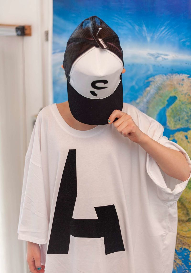
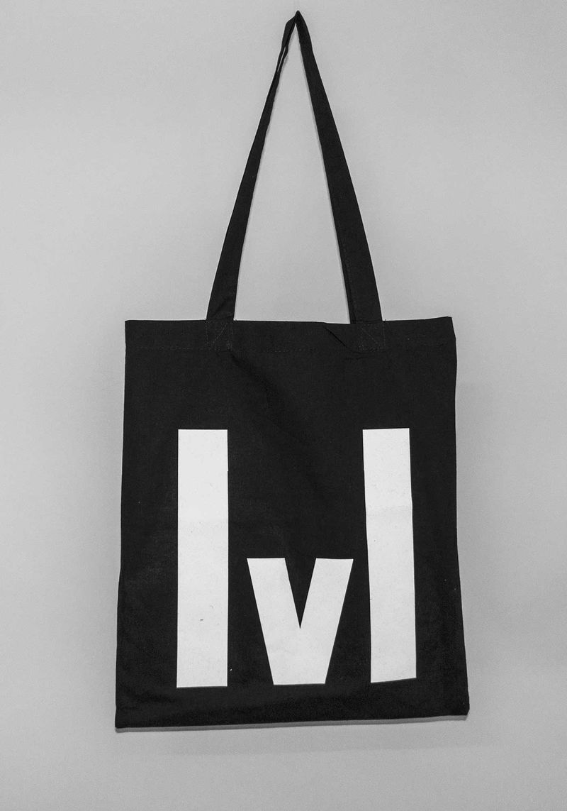
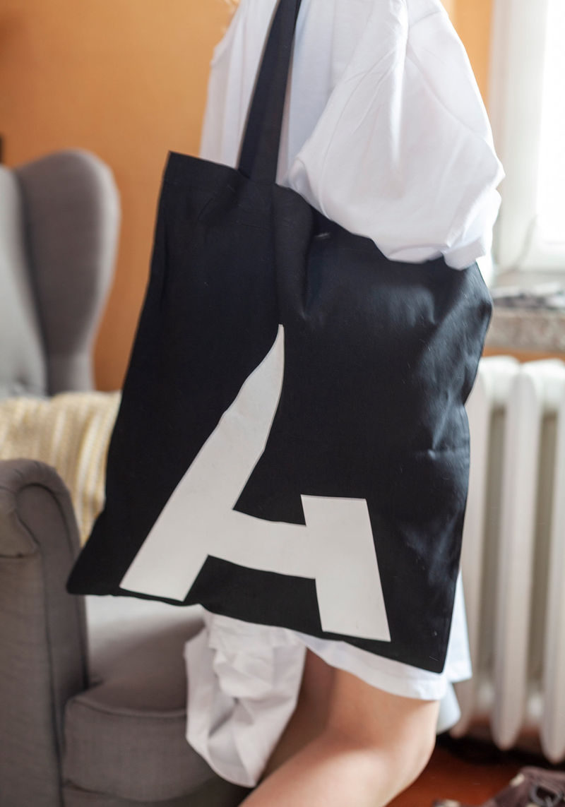
Mask-have emerged from a typographic experiment with the invisible. Noticeable in the AHA rules. Our writing system, in which individual letters keep their distance and only function in interaction, becomes a symbol of the pandemic. Mask-have explores the border between individualisation, identification, reinterpretation. The intervention in the typeface is harsh and the same for everyone.

Concept
The concealed, invisible and just recognisable challenges the viewer. Can he solve the riddle? This missing part is so striking that it allows the figurative mark to be changed.
Design development
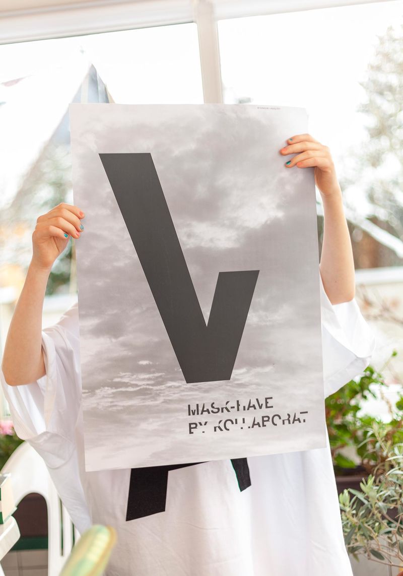
The colours in the typography are factual, restrained, emotionless, b/w. In the greyscales of the imagery, the facets and the complexity of the pandemic become recognisable. The images show the sky and in it refer to breathing air, freedom, the future, longing, transmission, the global.
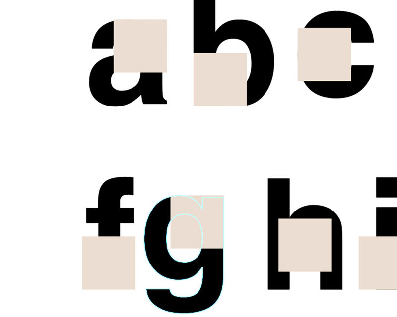


Type design
A typeface is an essential component of a brand full of character. For Mask-have, it is even the starting point of the brand idea. It conveys the brand message and ensures a flexible, recognisable appearance.


Implementation
Brands live by offering relevant touchpoints for their target group. Branding is the magic word. It means the planned relationship building and image cultivation between company and user. So Mask-have only lives with you!

Result
Brands become visible through visual repetition while remaining flexible and diverse. Mask-have is suitable as a model to illustrate the visual power of brands that Kollaborat develops. Graphic signs generate attention and stimulate interest. Images trigger desires or activities.


Project facts
Time: April 2020 – March 2021
Client: initiated by Kollaborat
Job: Brand development with reference to the Corona crisis
Participation: Jakob Gleisberg, Hendrik Möller, Joey Förster
This work was shown in March 2021 at the “Werkschau - Made in Sachsen” 2021 in Chemnitz.
Link to the Werkschau 2021
